
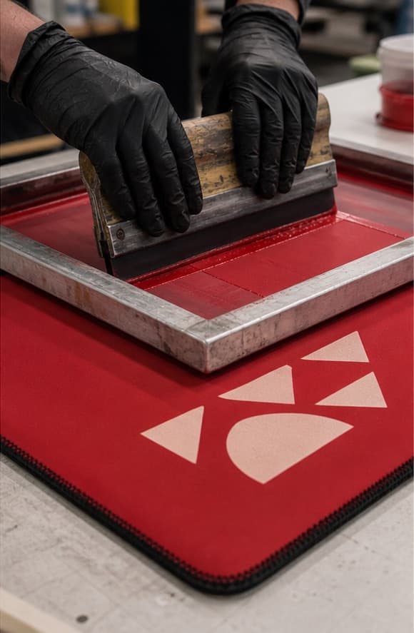
Short answer: choose dye sublimation for photographic imagery, gradients, many colors, and full-surface patterns on a suitable light polyester-laminated neoprene. Choose screen printing for simpler logos, limited spot colors, and designs that need a direct, graphic appearance on selected fabric colors. The correct method depends on the artwork, base material, color expectation, quantity, seam placement, and approved physical sample—not on a claim that one process is always superior.
Printing is often treated as the last decoration step in a custom drink sleeve order. In practice, it changes the material choice, artwork template, production sequence, color conversation, sampling plan, and sometimes the minimum economic quantity. If the print method is selected after the product structure, material color, and delivery plan are already fixed, the buyer may discover that the intended artwork cannot be reproduced as expected.
This guide compares the two methods EDIOM SPORTS buyers ask about most often for custom neoprene can coolers, coffee sleeves, bottle sleeves, and related drink-sleeve products: dye sublimation and screen printing. It focuses on purchasing decisions rather than press-operation instructions. Exact inks, temperatures, dwell times, and curing systems belong to the approved supplier process and material combination.
What dye sublimation does on laminated neoprene
Neoprene foam is commonly laminated with a textile face. In a sublimation workflow, the design is first printed in reverse onto transfer media with sublimation dyes. Under controlled heat and pressure, the dyes transfer into a compatible polyester surface. Epson’s explanation of dye sublimation similarly emphasizes that the process works with polyester fabric or a polyester-coated surface. On neoprene products, the printable layer is therefore part of the material specification.
Because the color enters the polyester face rather than forming a thick film above it, sublimation can preserve a textile-like hand feel and reproduce detailed, continuous-tone artwork. It is well suited to floral patterns, photographs, gradients, illustrations, camouflage, repeated motifs, and designs that cover nearly the entire visible sleeve.
Where the white in a sublimated design comes from
Standard sublimation does not normally lay down an opaque white ink. White or very light areas are created by leaving the white polyester face unprinted. This matters when a buyer wants a design on black, navy, or another dark stock fabric: the dark face cannot provide the bright base needed for the same result. A common solution is to begin with white printable polyester, reproduce the background color as part of the design, and then confirm the final edge and seam appearance in a sample.
Why full-wrap artwork still needs seam planning
“All-over” does not mean the seam becomes invisible. The flat panels are printed before sewing, and the design then wraps around edges, joins, binding, handles, or a base. Fine lines and critical logos should not be placed directly on a seam unless the product and artwork are specifically engineered for that result. Use bleed for background coverage, keep essential information inside safe zones, and view a sewn sample from all sides.
What screen printing does on a neoprene face
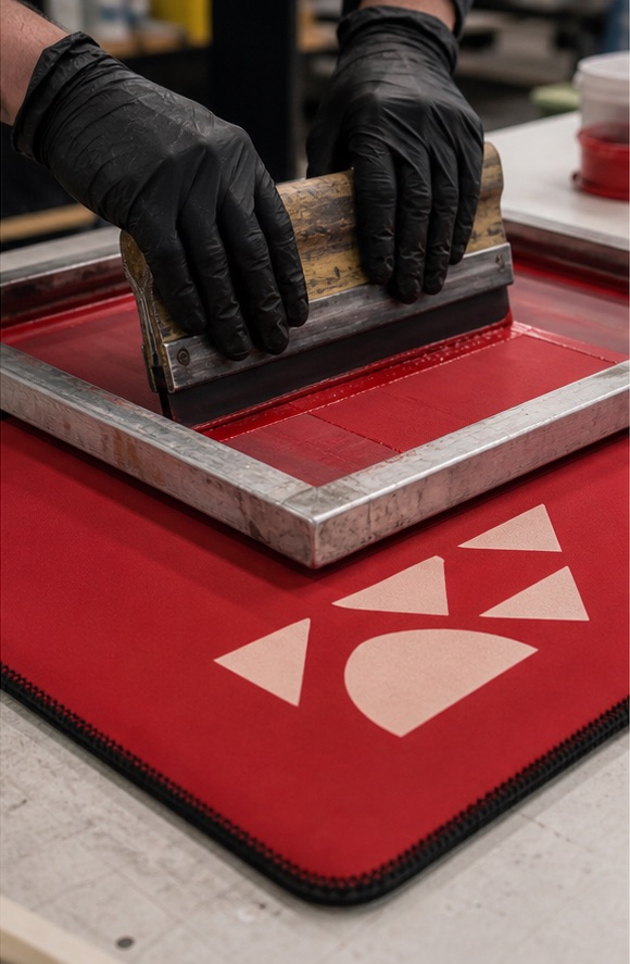
Screen printing uses a prepared screen to place ink through open image areas onto the textile surface. Each spot color is separated and printed in its own controlled pass. Adobe’s commercial-print guidance describes spot colors as premixed inks that require separate plates or separations; in a screen-print workflow, the same purchasing principle applies: every color adds setup, registration, and ink decisions.
For neoprene sleeves, screen printing is often effective when the graphic is a one- or two-color logo, bold lettering, a simple icon, or a limited-color campaign mark. The base fabric can remain a selected stock color, which means the product color itself contributes to the design rather than being simulated across the entire surface.
Spot color does not mean “identical on every substrate”
A brand may supply a Pantone or another color reference, but the appearance of ink is influenced by the ink system, fabric color, fabric texture, opacity, curing, lighting, and viewing conditions. Adobe also cautions that on-screen color values are simulations and recommends working from printed color references for critical spot colors. A physical sample on the actual neoprene face is the appropriate approval tool.
Registration and minimum detail
When multiple screen colors meet, registration tolerance matters. Extremely fine reversed text, hairlines, distressed micro-details, and complex transparency effects may need to be simplified. Text should be outlined, strokes expanded where appropriate, and colors separated cleanly. The supplier should review the artwork at final print size rather than assuming that a vector logo that looks clean on a large monitor will remain practical on a small sleeve.
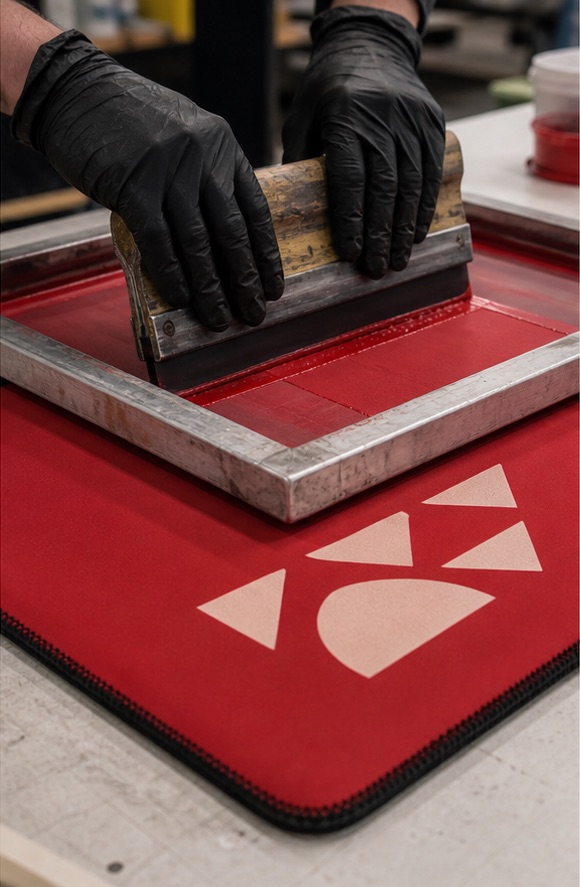
Sublimation vs. screen printing: decision matrix
| Decision factor | Dye sublimation | Screen printing |
|---|---|---|
| Best artwork type | Photos, gradients, many colors, repeated patterns, full-wrap graphics | Simple logos, bold type, limited spot colors |
| Typical base face | Light or white compatible polyester | Selected stock face colors, subject to ink compatibility |
| White areas | Usually supplied by the white base fabric | May use an opaque ink system if approved for the material |
| Hand feel | Color is integrated into the polyester face | Ink layer can be felt depending on ink and coverage |
| Color setup | Process reproduction from the artwork and color-managed workflow | Separate screen/setup for each spot color |
| Primary cost driver | Printed area, material, size, artwork preparation, and quantity | Number of colors/screens, print positions, size, and quantity |
| Key sample risk | Color shift, seam alignment, dark-area reproduction | Opacity, registration, curing, stretch behaviour |
Choose by artwork, not by a generic price rule
Buyers sometimes hear that screen printing is cheaper for large orders or sublimation is cheaper for small orders. Those statements can be directionally useful but are not universal quotations. A one-color screen print has setup cost that can be spread over a larger quantity. A complex eight-color design may make that route impractical. Sublimation avoids a separate screen for every artwork color, yet full-surface production, transfer media, material preparation, and color management still carry real costs.
Ask for both methods only when both are technically suitable. Otherwise the cheaper comparison may be misleading because it does not produce the same visual result. A focused enquiry should specify quantity per artwork, print positions, product size, required coverage, base color, packaging, and delivery terms.
How the print choice affects MOQ
Minimum order quantity is not determined by printing alone. Material purchasing, lamination, cutting, sewing setup, color changes, packaging, and factory scheduling all contribute. EDIOM SPORTS currently communicates a starting point of 100 pieces per design and per size for the featured Coffee Sleeve program, subject to construction, material, printing, and packaging confirmation. Another product or process can have a different practical minimum.
For screen printing, each artwork color and print position adds setup. Combining many designs in one order does not always combine their minimums because every design requires its own preparation. For sublimation, individual artwork can still require separate file preparation, transfer output, cutting alignment, and approval. Always ask whether the stated MOQ is per order, per product, per size, per base color, or per artwork.
Artwork preparation checklist
For both methods
- Identify the final product, size, print area, and approved supplier template.
- Outline fonts or include properly licensed font files.
- Use linked or embedded images at suitable final-scale resolution.
- Provide brand-color references and explain which colors are critical.
- Mark the intended front, back, seam, handle, binding, and base orientation.
- Assign a revision number and approval date to prevent an older file entering production.
Additional checks for sublimation
- Use adequate bleed beyond the cut line.
- Keep critical text and logos away from seams and trim risk.
- Review RGB-to-production color expectations with the supplier rather than approving from a phone screen.
- Check whether the design depends on white ink; if it does, normal sublimation may not reproduce it as expected.
- Inspect dark backgrounds, gradients, skin tones, and fine repeated patterns in the physical sample.
Additional checks for screen printing
- Convert text and strokes to stable vector shapes.
- Separate each spot color clearly and remove accidental duplicate swatches.
- Confirm minimum line weight, reversed-detail size, and trapping requirements with the printer.
- Specify whether the print is one side, two sides, or wraps across a joined construction.
- Approve ink opacity and color on the actual face fabric, especially on dark colors.
What to inspect on the physical sample
Color is only one part of approval. Stretch the sleeve onto the target container, remove it, and repeat. Look for cracking, whitening, distortion, or ink transfer. Check whether heavy printed areas change the hand feel. Inspect the edges of fine details and the registration between colors. For sublimation, review banding, unintended ghosting, seam alignment, and color consistency across panels. For screen printing, review opacity, pinholes, registration, curing, and the way the ink behaves around a seam or high-stretch area.
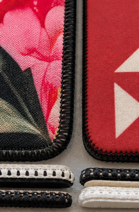
Color approval: use a hierarchy of evidence
- Brand reference: establish the intended color using the buyer’s approved guide.
- Supplier interpretation: confirm how that target will be produced with the chosen material and method.
- Digital proof: use it to approve content, scale, orientation, and layout—not as the only color standard.
- Physical printed sample: review under agreed lighting on the actual material.
- Production reference: retain an approved sample or controlled record for bulk comparison.
If exact cross-material matching is important, state that early. The same brand color can appear different on paper packaging, coated metal, white polyester, and a textured stock fabric. The goal may need to be an acceptable visual family rather than a physically identical spectral result across unrelated substrates.
When a hybrid print strategy makes sense
Some product programs contain several sleeve designs rather than one. A full-color retail collection may use sublimation, while a corporate-event version uses a one-color screen print on stock fabric. Treat those as separate specifications and samples. Do not assume that artwork, color, lead time, or MOQ can be transferred unchanged between methods.
Special labels, patches, heat-applied graphics, embroidery, or other decoration may also be feasible for certain structures, but every added component changes cost, flexibility, thickness, wash behaviour, and the approval plan. Use them because they solve a design or positioning need—not simply because they appear in a supplier capability list.
Three artwork scenarios and the likely starting method
Scenario A: a photographic retail collection
The design contains gradients, illustrated characters, small color transitions, and different artwork on each side. Sublimation is usually the stronger starting point because it can reproduce a complex, continuous visual on a suitable light polyester face. The sample should focus on color interpretation, detail at final scale, seam placement, and whether important elements remain readable after the sleeve stretches around the container.
Scenario B: a one-color event identity
The sleeve uses a stock dark fabric with one bold white logo and a short date line. Screen printing is often the more direct option. Confirm opacity on that exact fabric, the minimum readable size of the date, and whether the logo crosses any high-stretch or stitched area. A physical strike-off or finished sample is more useful than a monitor mockup because the contrast and ink film are material-dependent.
Scenario C: a brand system with several product tiers
A buyer may want full-color sleeves for retail, restrained spot-color versions for corporate gifting, and blank solid-color units for an internal program. Do not force one method across all three merely to simplify purchasing. Use a shared color and artwork-control system, but quote and approve each construction separately. Variant-level specifications prevent the premium version’s requirements from being accidentally applied to the value version—or omitted from it.
Build a print approval record that another person can follow
A good approval record is understandable even if the original buyer or production coordinator is unavailable. Include the product code, container reference, material and face color, print method, artwork filename and revision, approved dimensions, approved physical sample date, named color references, acceptable intentional differences, packaging, and clear photographs of every side. State whether the approval covers layout only, color only, or the complete finished product.
When corrections are requested, consolidate them into one marked file and issue a new revision. Avoid approving a logo in one email, color in a messaging app, and seam position in a separate spreadsheet without a final summary. The supplier should confirm which revision is released for bulk production. This is less glamorous than choosing a print method, but it is one of the most effective ways to protect consistency when multiple designs and deadlines are involved.
Final recommendation
Use sublimation when the artwork needs visual complexity and broad surface coverage on a suitable light polyester face. Use screen printing when the design is focused, the color count is controlled, and the selected base fabric is part of the visual concept. Then validate the result on the real product, at final scale, on the target container.
The most reliable print decision is made before the purchase order: artwork reviewed, method selected, material confirmed, seam and safe zones understood, physical sample approved, and production reference documented. That sequence protects both visual quality and delivery timing.
Sources and editorial disclosure
The process overview was checked against Epson’s explanation of dye sublimation and Adobe’s guidance on spot and process colors. Product-specific recommendations reflect EDIOM SPORTS’ custom neoprene artwork and sampling workflow. They are not universal press settings. The supporting visuals are AI-generated educational illustrations, not evidence of a specific customer order or production test.